

December 15th 2023
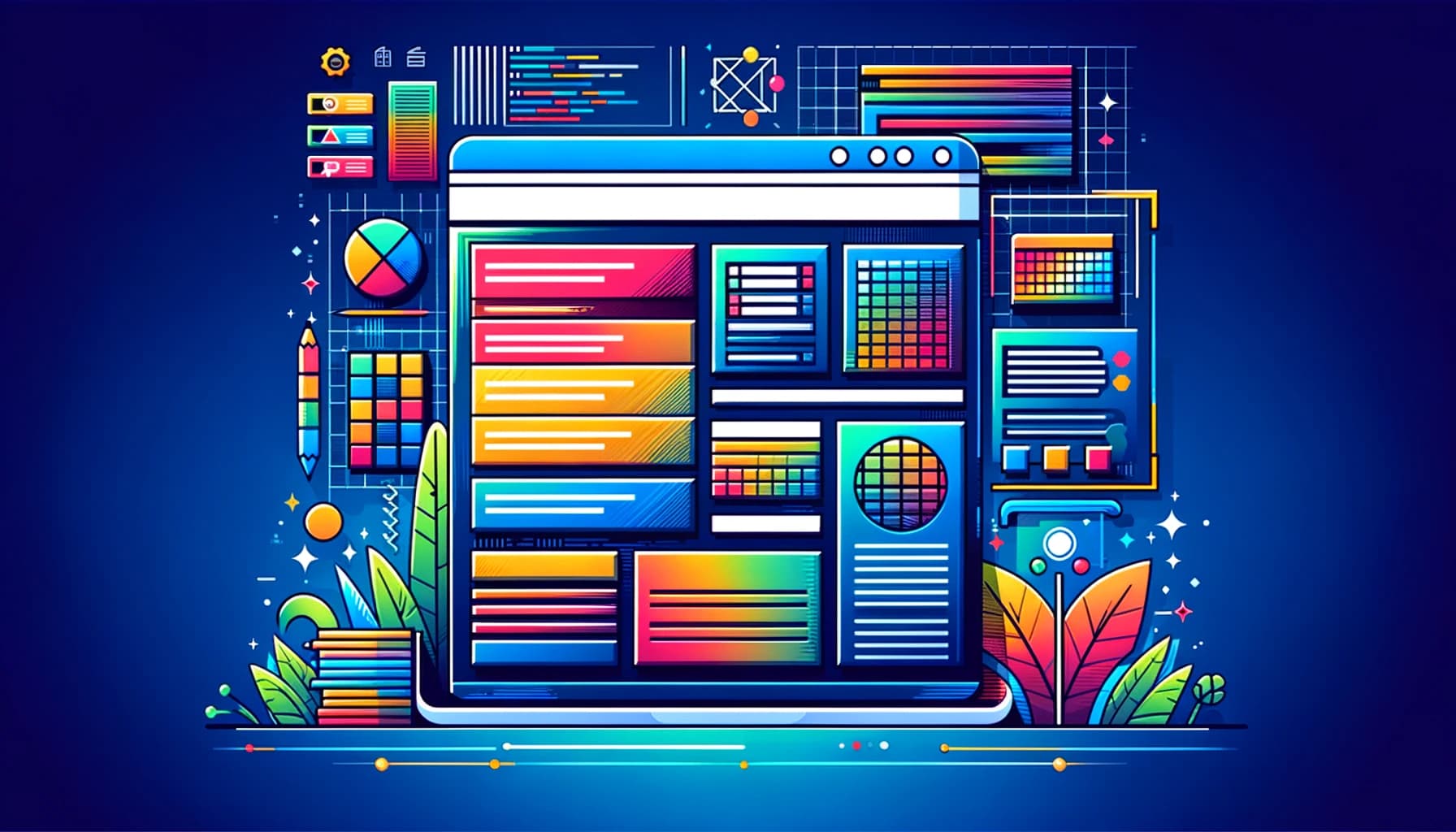
The Benefits of CSS for Professional Web Design
Today, CSS plays a critical role in web design and is an essential tool for creating visually appealing, user-friendly websites.
CSS (Cascading Style Sheets) is a style sheet language that is used for describing the look and formatting of a document written in HTML. It was developed in the late 1990s as a way to separate presentation from content and make web design more flexible and efficient.
In this article, we give you the benefits and importance of CSS in web design.
Contents
What is CSS?
CSS is a styling language that is used to define the look and layout of a webpage. It uses selectors to target specific HTML elements and apply styles to them. The syntax of CSS is straightforward, and it is easy to learn and use. CSS works in conjunction with HTML to provide the visual presentation of a website. It can be written in separate files or directly in the HTML document, and it can be applied to multiple pages, making it easier to maintain a consistent look and feel across a website.
Importance of CSS in web design
CSS (Cascading Style Sheets) is an integral part of web design and plays a crucial role in shaping the visual appearance and layout of a website.
Here are five key reasons why CSS is essential in web design.
Visual Presentation
CSS allows web designers to control the presentation of HTML elements on a webpage. It enables them to define fonts, colors, margins, padding, borders, and other visual properties to create a visually appealing and consistent design throughout the website.
Separation of Content and Design
It promotes the separation of content from design. With CSS, the actual content of a website (HTML) can be kept separate from its presentation. This separation makes it easier to manage and update the design without affecting the content, and vice versa. It also improves the website’s accessibility and SEO
Responsive Web Design
In the modern era of various screen sizes and devices, responsive web design is crucial. CSS plays a significant role in making websites responsive by allowing designers to use media queries and flexibly adjust the layout and design based on the user’s device. Examples of this are mobile phones, tablets, and desktops.
Adaptability for Future Design Changes
As web design trends evolve and new features are introduced, CSS can easily adapt to these changes, allowing websites to remain visually appealing and up-to-date.
Accessibility
Also, it allows designers to create accessible websites that are usable by people with disabilities. By defining proper headings, landmarks, and focus styles, designers can ensure that all users can access and navigate the website effectively.
Benefits of using CSS
Using CSS (Cascading Style Sheets) in web development offers a wide range of benefits that contribute to the overall efficiency, flexibility, and user experience of a website.
Here are some of the key advantages.
Consistent Styling
With CSS it enables web developers to define styles once and apply them to multiple elements across the entire website. This consistency ensures a unified and professional look, making it easier for users to navigate and understand the content.
Animations and Interactivity
CSS supports animations, transitions, and interactivity without the need for additional scripting. This capability enables developers to create engaging user experiences without relying heavily on JavaScript.
Improved Page Loading Speed
CSS files can be cached by web browsers by minimizing the amount of repetitious styling code. This caching leads to faster page load times for returning visitors, enhancing user experience and SEO ranking.
Efficient Updates
By changing just a few lines of code, CSS allows developers to worldwide change a website’s look. This effectiveness reduces time and work, especially for complex online projects.
In summary, CSS is a powerful tool that enhances the design, performance, and user experience of websites. It promotes a more efficient and manageable development process while ensuring a consistent and visually appealing presentation across various devices and browsers.
Furthermore, this leads to a more visually appealing and professional-looking website. CSS also enables designers to create user-friendly websites by controlling the layout, navigation, and interaction design. Additionally, the use of this can improve website performance by reducing the size of HTML files and allowing for faster loading times.
CSS in Responsive Web Design
Responsive web design is a technique used to make websites adapt to different screen sizes and devices. CSS plays a central role in responsive web design, which is the practice of creating websites that adapt and respond to different screen sizes and devices.
Additionally, by using CSS, designers ensure that the layout and presentation of a website adjust seamlessly based on the user’s screen size. Like desktops, tablets, smartphones, and other devices. Here’s how CSS is used in responsive web design
Media Queries
Media queries are a fundamental aspect of responsive web design in CSS. They allow designers to apply specific CSS rules based on the characteristics of the user’s device, such as screen width, height, resolution, and orientation.
For example, different styles can be applied for screens larger than a certain width (e.g., desktops) and screens smaller than that width (e.g., mobile devices).
Fluid Layouts
CSS can be used to create fluid layouts that adapt to the screen size. Instead of fixed pixel widths, designers can use relative units like percentages or viewport-relative units (vw, vh) to define widths and heights. This ensures that elements on the page automatically adjust to the available screen space.
Flexible Images and Media
Furthermore, it can help make images and media elements responsive by setting max-width to 100% and height to auto. This way, images will scale down proportionally to fit the screen size without overflowing or distorting.
Mobile-First Approach
CSS in responsive web design often follows a mobile-first approach. This means designing for mobile devices first and then gradually adding more CSS rules for larger screen sizes. It ensures a better user experience on small screens while enhancing the design for larger screens.
Advanced CSS Techniques
Advanced CSS techniques push the boundaries of what can be achieved with CSS and allow web designers and developers to create more complex and interactive web experiences.
Here are some advanced CSS techniques.
CSS Grid Layout
Moreover, CSS Grid is a powerful layout system that enables designers to create complex grid-based layouts with rows and columns. It allows for fine-grained control over the placement of elements and is particularly useful for creating responsive designs
CSS Flexbox
Flexbox is another powerful layout system that is designed to create flexible and dynamic layouts. It allows elements within a container to automatically adjust their size and alignment based on available space.
CSS Animations and Transitions
With CSS animations and transitions, it enables designers to create smooth and visually appealing animations without relying on JavaScript or external libraries. Additionally, animations can be used to enhance user interactions and provide visual feedback.
CSS Variables (Custom Properties)
CSS allows you to define and reuse values throughout your CSS codebase. It provides more flexibility and makes it easier to maintain and update styles across the website.
Conclusion
In conclusion, CSS is an essential tool for web design that provides the ability to control the presentation and layout of a website. The benefits of using CSS include improved presentation and consistency, enhanced user experience, and increased website performance.
In addition, CSS is also a crucial component of responsive web design and is used to create websites that look great and work well on all devices. With its versatility and power, CSS is a valuable tool for any business owner interested in creating high-quality, engaging websites.